By Nick Thomas
In the beverage world, the key to standing out is usually a competition for the most unique bottle shape. Just hearing someone say Crown Royal, Sonoma Cutrer, Patrón, Robert Mondavi or Maker’s Mark should immediately conjure up each respective brand’s iconic profile. But the beer and cider industries don’t typically have unique bottle varieties, so they’re left to get as creative as they can with the label. Here are five ciders with stand-out labels that you won’t be disappointed by just because you picked it up for looking interesting.
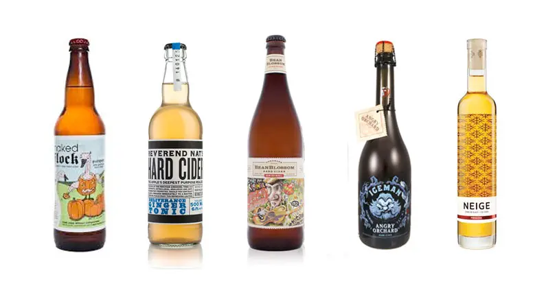
- Naked Flock’s Original Cider (Warwick, New York)
ABV: 8 percent
Why it stands out: While other ciders are trying to make a label that speaks to the serious tone of the intense labor and craft poured into creating a quality cider, Naked Flock pulls a Joker card and asks, “Why so serious?” This Champagne-yeast and honey-sweetened cider has a very shocked and confused church priest on the label who seems unsure of what to make of a flock of featherless geese—all of which have their anatomical little geese-y parts censored in a clever way. - Reverend Nat’s Deliverance Ginger Tonic (Portland, Oregon)
ABV: 6.1 percent
Why it stands out: Many ciders try to capture the feeling of their traditionally made cider with an old fashioned label, but Reverend Nat’s bottles stand out as feeling simultaneously old fashioned and modern, especially on their off-dry ginger cider. The sole use of text and lack of any shapes or a flashy logo gives makes it feel almost like it’s an ad torn from an 1800’s newspaper, but the choice of more current fonts and basic color scheme make it feel right at home in 2014. - Oliver Winery’s BeanBlossom Original Hard Cider (Bloomington, Indiana)
ABV: 9 percent
Why it stands out: Oliver Winery’s cider brand BeanBlossom recently updated the label for its bright and crisp Original variety. Previously, their bottles and cans were very colorful, wacky and featured what appeared to be characters from those old Far Side comics. This updated version is still comic-like, but in a more subdued manner that looks less like it belongs in the Sunday Funny Pages and more like something your local sandwich shop would artfully doodle on the chalkboard advertising its daily special – that is to say, it’s very inviting and eye-catching. - Angry Orchard’s Iceman (Cincinnati, Ohio)
ABV: 10 percent
Why it stands out: Angry Orchard’s ciders already standout on the shelf with their iconic box featuring, as the name implies, a grumpy old and gnarled apple tree. But the label’s new craft Cider House Collection stands out even more so, especially the Iceman variety. The label of this ice cider is a chilly blue on a very dark background with the head of a character (presumably an “iceman”) who looks like something straight out of that old stop-motion Rudolph the Red-Nosed Reindeer TV movie. - La Face Cachée de la Pomme Neige Première (Hemmingford, Québec)
ABV: 5 percent
Why it stands out: Just like with Reverend Nat’s label, sometimes a simple label can grab more eyeballs than a busy one, and it doesn’t get much simpler than the Neige Première by La Face Cachée de la Pomme. The snowflake pattern in the background not only simply and properly articulates to the average passer by that this bottle contains an ice cider, but it does so in a clever and interesting way that utilizes the fact that both glass and cider are transparent by putting the majority of the front-facing label on the back of the bottle.

